Monday 18 March 2013

Studio Photography: Low-Key

Low-Key

Low-key lighting is when only one main light source and usually a black background is used to light the subject.  It works very well on male subjects and helps to give them a dark, masculine and sombre look. Although, I have seen low-key lighting work just as well on female subjects.  Low-key lighting is fairly opposite to high-key lighting.  There are more shadows and darker tones, helping to create a contrast in the image.  Low-key lighting can create drama and highlight the skin tone and contours of the face, which adds to the personality of the subject.           


This is a classic Hollywood image of Johnny Depp, and one I thought that demonstrated low-key quite well.  You can tell one light source was used to light one side of his face but it also appears that another low light may have been used to create a contrast between his hairline and the background.  It's not a very serious look but still works really well to highlight his strong masculine features.      


To create our low-key image the studio was set up with a black background and one poly board to block off light from one side and another two placed at an angle to allow in only a narrow band of light.  The lighting was very much controlled because of the poly boards and reduced any spillage.    


The first image is of one of my female classmates.  This image demonstrates how this type of lighting can work with a female subject and convey a similar sort of message to the male one.  The lack of smile on the subjects face shows the serious side her to her character.  It's quite an atmospheric image and works really well because of the outline of the hat follows through to the outline of her face.  The reason I didn't choose this image is because of the lack of eye contact and so it doesn't hold my attention long enough before I want to move on.         


I chose this image for my final submission because  for me it represents low-key extremely well.  It also helps to have a subject who's good at making faces and so happened to make the right face in this situation.  I really like the way the light has caught his eyes and falls down nicely from his face to his hands and down his arms.  There's a lovely line which helps to guide your eyes through the image.  The strong eye contact holds the viewers attention and the look in his eyes makes you question what they're trying to tell you.  Utilising selective lighting and using dark shadows as primary elements, this low-key light set up has helped me to create an image that looks very mysterious and atmospheric.      


Finally I decided to include this image I took prior to doing my single portrait shoot. This was done as a test shoot so I could experiment with the lighting before I had my model in the studio.  For this I used a single light which has helped me to create a low-key image.  It has all the qualities of a low-key image - a sense of drama, atmosphere and a sombre feel to it.  I'm very pleased with this image as I felt a lot more confident playing around with the lights to get what I really wanted.  It shows how practise can really make you perfect - although not quite perfect in my case!     


Studio Photography: Portrait & Still Life

Portrait

One of the tasks I was least looking forward to doing was the one piece of studio portrait we had to produce by independently assembling the set and lighting.  Not because I was worried about setting up the studio or lighting but mainly because working with models was my least favourite activity. And my experience whilst trying to organise this has only reinforced my views about working with models.   

I initially asked Sara from my class, whether she knew anyone who may be interested in doing some modelling for me.  She gave me details of someone she knew who I contacted and arranged to come in the studio on a specific date.  When I got into college the following week, I noticed my name had been crossed out from the studio diary and instead replaced with something along the lines of 'FdA priority' I presume it meant the degree students were using the studio. So I quickly cancelled my model and told her I would contact her soon to give her a different date.  Later that day, Andrea my very generous classmate offered to let me use the studio for one of the mornings she had it booked, as she was busy doing something else that morning. I contacted the model but she wasn't available that day!! I desperately tried to get another model and luckily for me, Rukudzo, kindly helped me to recruit one via the wonders of Facebook.  It was all set and ready to go until the night before the shoot when I decided to text my model to check everything was ok, when I'm told that her dad can no longer give her a lift! Not wanting to lose my model, I offer to pick her up in the morning. Little did I know what was to come next!!.  On the morning of the shoot I get a text from her saying there's a problem with their boiler and she has to stay home and wait for work men! it's not really her fault and there wasn't a lot she could do about it, but it didn't help my situation! 

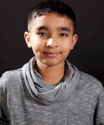
I didn't want to waste my morning and the studio was already booked so I decided to pick my nephew and made my way in to college.  I took quite a few photographs of my nephew, but like most children, his attention span wasn't great and I found it difficult to keep him still without him getting bored.  When he did stay still he would freeze up a little and his expression did not look very natural. Perhaps if I had taken something in like a toy or something to entertain him then maybe I would have got him in a more relaxed state.  However, it was all last minute and I didn't have much time to plan this shoot.  


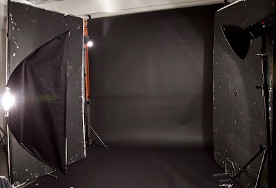
Initially the lighting set up included the black ground with the two black poly boards on either side.  I didn't want any additional light spilling onto the subject from the sides or to create any unwanted shadows.  I used a beauty dish, which is great for portraiture and to light up my nephews features and a softbox to soften the light a little.     


The resulting image was ok, and this is the best one of the bunch as he's got a lovely expression on his face, good eye contact with the camera and a fairly relaxed pose. I think the image looks much better in black and white than colour but the problem here is that because he's got black hair it seems to have merged with the background.  There's also a some shadows under his chin and I should have used the reflector to eliminate this. 


I decided to change the light set up around to get a bit more light from behind his head so you could see the hairline. For this I used a snoot, which gives a sharp directional light.  I also used a rectangular softbox to give a narrow band of light as I wanted to do a full length portrait.    


This is the best image from that set up. I decided the full length portrait didn't look as good so I cropped this image to bring the attention to his face.  I'm still not very happy with the image because a strong light has fallen to one side of his face and looks a little over exposed and there's still some shadow on the top of his nose.  I could have used a smaller aperture to let in less light but then I may have under exposed the rest of the image.   I also think he has a glazed look on his face, which doesn't reflect his personality very well or do justice to how he really is - lively, chatty, inquisitive and cheeky! he was quite bored by then and just wanted to go home! who can blame him? standing in front of the glare of the studio light for half a day!   


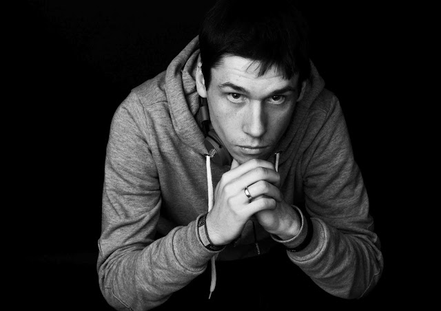
Not entirely satisfied with my result I decided to book the studio for the following day and possibly use one of my fellow class mates to model for me.  It was then I came across Roman, who made a bit of an impression on me. Piercing eyes, very strong jawline and well structured cheekbones, I immediately thought he had the perfect face for a strong portraiture.    


I changed the studio lighting around a few times to see what sort of result I could achieve and practised on two willing victims (Andy and Sara!). I finally settled on a slightly low key set up with black background, black poly boards on either side, two soft boxes in front for a slightly high-key affect and a light with honeycomb from behind to illuminate one side of his face/hairline.    


I quite like this image of Roman and it does look better in black in white than did in colour but just like my nephews photograph, it was difficult to separate his hairline from the background.  Otherwise, I do feel it's a fairly strong portrait as the lighting works really well on his face.  I used a new Black & White Adjustment Layer on Photoshop and then used Hard Light on the blending option to bring out his features.   


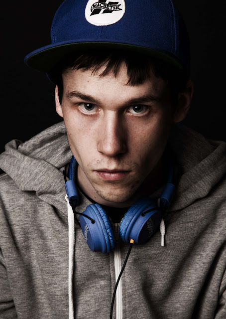
For my final submission I selected the following image.  I feel it's a really powerful image and one that draws you in to look deeper into his eyes. It's by far the strongest portrait I have produced in the studio to date.  I love the look in his eye, they look quite menacing and slightly intimidating - exactly the look I was aiming for.  The light worked quite nicely as it highlighted one part of his face whilst the other side was slightly darker, adding to the moodiness his character.  The cap on his head and the headphones around his neck gives the impression of a young trendy person, but with a slightly serious side to him. The image works really well because everything he's wearing contrasts very nicely with the dark black background, without blending in to it.  To sharpen his features even further and to give him that slightly edgy look I turned the image to black and white and then used the Hard Light blending option. I feel this has given him a slightly rugged look, which compliments his features very well.                


Still Life

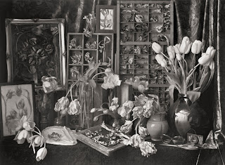
I've always enjoyed photographing flowers.  I think it's the colours, shapes, textures and variety that attracts me to them.  I think someone once said if you can master photographing flowers then you can photograph anything! could have been John Kiely?! Flowers have been traditionally photographed to represent their  soft, delicate and fragile quality.  However, having been shown images from the tulip series by well known British photographer, John Blakemore, I wanted to try my hands at something different.  Blakemore spent many years photographing still life, which included a series of images of tulips, where he would photograph them in natural light and particularly when they were past their best, typically a few weeks after their peak, capturing their gradual decline and natural elegance.


http://www.lenscratch.com/2012/12/john-blakemore-at-klompching-gallery.html

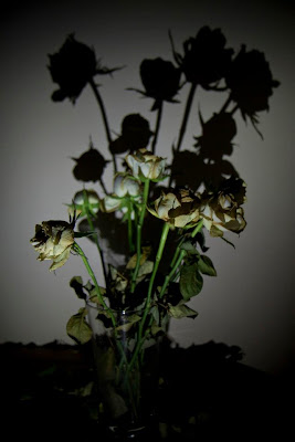
For my still life I decided do some experimenting at home with a bunch of flowers I had.  I'd had them for a while so they were gradually wilting and withering away.  I took the following images at night so I didn't have to worry about any light spillage from outside.  I turned the main room light off and made sure there was no light coming in from any windows or doors.  I then used the assistive light on my mobile to direct it towards the vase of white roses I had placed on the dining table.  I wanted to highlight the decay of the roses and create a dark and moody atmosphere at the same time.  I quite like the two images below but I personally think they are a little too busy which can look a bit distracting.  I think the usage of a single light has worked quite well to create some nice shadows but overall the images are not strong enough to go in my final submission.     


I decided to isolate one of the roses and focus on creating one strong single image.  For this image I used just a table lamp which was pointing towards the rose. It was quite a strong light but I like how it has filtered through the whole rose, almost illuminating it from the inside.  As it was night time photography and the lamp had a tungsten light, it had created a golden warm glow to the white rose.  The textures on the petals show up very nicely, highlighting the beauty in its decay.         


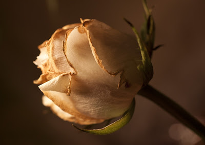
I feel the conversion to black and white and slight sharpening worked better with the rose and helped to bring out its characteristics and provide a nice contrast  with the background.  The viewers attention is now focused on the rose, with very little distraction.  In conclusion I feel it's a fairly ok image but its not strong enough to be included in my final submission - to me it looks too ordinary and somehow lacks imagination!.  However, due to time constraints I will make do with this for now, but I would like another attempt to produce something even better than this for my still life submission. For now, this'll have to do! 


Sunday 10 March 2013

Studio Photography: High-Key


High-Key 

High-key lighting is something that was used in the early days of cinema.  The aim of it was to reduce contrast, as early films and television could not cope with extreme contrasts of blacks and whites.      High-key photography involves the elimination of all shadows to produce a bright, crisp, well lit images, with very little tonal variation   These days high-key is very popular in fashion and portrait photography as they can evoke a feeling of freshness, optimism and energy.

This is an example of high-key lighting I grabbed from Google images.  The portrait has very little shadows and her features are highlighted very well.  This type of lighting compliments subjects that have a  fairer complexion and lighter coloured hair and possibly wearing pastel shades.    


The lighting set up for high-key is a white background with two 3k heads with deep reflectors pointing towards the background.  To light the subject you need two 1.5k softboxes pointing towards the subject.  Best to start off with the lights and subject at 45 degrees and then the position of the front light boxes can be adjusted as necessary.  To get a good spread of light and to bounce the light on the subject, it's a good idea to add white poly boards on either side.  The background lights should always be two stops brighter from the font lights in order to achieve an evenly lit portrait and to get a pure white background.        


High key lighting set up - white background with two deep reflectors pointing at the background and two large softboxes pointing towards the subject


I chose this image for my final submission for high key photography.  It was shot using a medium format camera and all the lighting was set up by John, our tutor.  The lighting diagram above demonstrates the set up for this shoot.  A reflector was used under the subjects face to bounce the light back and to reduce any shadows from appearing under her chin.  Using softboxes helped to create a softer pattern of light, highlighting her facial features.  

I've seen the rise in popularity of these types of images over the years, and can understand why it may appeal to some people, but I personally am not very keen on this type of photography.  To me it feels too clinical and gives no depth to the character of the individual. It works best in a commercial setting as the sole purpose would be to highlight specific features of a product in order to make it appealing to the consumer but definitely poor for showing mood or atmosphere.              

Wednesday 6 March 2013

Studio Photography: Lighting texture

When photographing still life objects, it's really important to have the correct lighting set up in order to capture the finer details and the textures and tones of the object.  

For this task I took a few items from home, which I thought would be ideal for texture.  Wasn't sure what to bring so just grabbed whatever was nearby.  I took an orange gerbera (to add a bit of softness) and some chickpeas, as I thought    the fine delicate petals of the flower would work nicely with the rough textures of the chickpeas. Although the colours complimented each other really well, I felt there was something missing.  This is when I decided to use one of my class mates shell alongside the other items.  Later on the day I collected a few leaves and tree barks to add a bit of variety to the images.

Photographing still life can be quite tricky and you may need to add various light sources to light up specific part of the subject.  You also need to have greater control of the lighting in order to create a certain mood or ambience as an inanimate object cannot react to different lighting conditions.   

For this studio session we used the Mamiya RZ67, which is a beautiful medium format camera.   
Leaf Valeo 17(LF5339)/Mamiya RZ 67      


http://www.lightingdiagrams.com/Creator


For the images below a flash light was placed high up from the back of the still life table, which had honeycomb and barn doors, almost directly opposite the camera.  This allowed the light to skim across the surface of the objects highlighting the textures.  The barn doors helped to control the direction of the light and and the honeycomb helped to diffuse it.  I used a gold card to eliminate the shadows that was falling on the chickpeas and to the side of the shell.  The good thing about using a gold card instead of a reflector is that you get nice patches of light instead of a solid reflection, enhancing the textures even further.       


This first image clearly shows the shadows and dark patches.  


The gold reflector has been positioned correctly which has helped to eliminate the shadows and  bring out the texture well. 


One the first image you can see a harsh shadow has fallen over the subjects with the light being positioned directly behind, and the second image shows the textures well as I placed the gold card in front.    


This is my final submission as I love the composition and contrast of colours and textures in this image.  The flower, leaves and tree bark work beautifully together and complement each other perfectly.  I think using the medium format camera has helped me to achieve a much superior quality of image, bringing out every single detail of the objects.  Which is why I did very minimal post production work on these images.

Monday 4 March 2013

Studio Photography: Studio lighting accessories

I'm a bit of a novice when it comes to using the studio and all the various paraphernalia that goes with it. Which is why I approached the studio unit with a certain amount of trepidation.  Having said that, I was looking forward to learning all about the diverse range of accessories you could have at your disposal to create the necessary visual effects to suit your relevant subject matter.

The benefits of studio photography is the lighting is artificial and you are able to control it to suit your subject matter, although it doesn't always have to take place within a studio setting or even indoors.  There are also many subject matters that can be photographed within a studio setting.

Studio can be used to photograph:
  1. Food 
  2. Products for advertising/commercial 
  3. Animals 
  4. Fashion
  5. Portraits 
  6. Still life

On the first night we were introduced to studio, which now seems like many moons ago, John gave us a whistle stop tour of all the relevant health and safety issues associated with using the studio. We were also introduced to a number of studio accessories we could use when photographing people/still life to create a particular mood or ambiance, whilst highlighting key features and characteristic.

There are two types of light sources that can be used in the studio.  A continuous light source, sometimes referred to as 'Red Heads' and a studio flash unit (strobe) to produce a variety of images.  The continuous light source usually uses halogen, fluorescent or tungsten light bulbs. The strobe has a modelling light which can be adjusted and is usually good for portraiture.

We produced a series of images using the the studio flash unit and a range of light modifiers.  Light modifiers are great for controlling the amount of light you have on your subject.             
  • Softbox
  • Beauty dish
  • Snoot
  • Honeycomb
  • Deep reflector

Softbox

As the name suggests, the softbox is perfect for providing a softer and diffused pattern of light.  They come in all shapes and sizes and are good for providing an even coverage of light.  I used a rectangular softbox on the portrait below, for no other reason other than the square one was being used by the other half of the class.  The effect of using this type of softbox has resulted in giving a narrower band of light.  And as the subject has his head turned away from the light, it has resulted in some shadows on his face.       


Beauty dish

A beauty dish can provide a larger area of low intensity light and easier to control than the softbox.  The light hits the smaller dish, which is then reflected on to the larger dish, thus providing a softer and more diffused form of light.  They can also be fitted with a honeycomb to soften the light even further.  Using the beauty dish on this portrait has given a nice even soft coverage.  It has also eliminated most of the shadows, and is great for fashion shots.       


Snoot

This is a small circular directional light which gives a strong contrast.  It can be quite harsh and is not always best to use on its own.  The light can be quite narrow and concentrated, lighting a small part of the subject.  Although it has provided a good light on the subject, you can still see some strong shadows.      


Honeycomb grid

The honeycomb produces narrow beams of light whilst giving a soft edge all around it.  Unlike the snoot, the light is less harsh and not as focused or as intense.  The grids can vary in size, which indicates the tightness of the beams of light.  The positioning of the subject has cast a bit of a shadow to one side of the face.  A gold or silver reflector or a softbox could have been used  to eliminate this.              


A deep reflector

Gives a larger area of light, although not as strong as the snoot or as soft as the beauty dish or the softbox. The area inside the reflector is usually matt or silver and is quite contrasty.    


The first night we used all the light modifiers was quite rushed and didn't allow me to have a good understanding of the effects of using each modifier.  However, following on from there I have got to use the studio a little bit more, which has helped to become a lot more familiar with the characteristics of the different accessories and  the best usage for each one to get the desired effect.     

Friday 1 March 2013

Wide angle perspective distortion

I missed the morning session of the class due to personal reasons so wasn't sure exactly what I was required to do.  However, after speaking to colleagues, I was told we were given the task to photograph something using the wide angle lens from a high or low perspective.  I still wasn't too clear about it but went on to seek inspiration around the college.
Using the college wide angle lens (Sigma 10mm-20mm) I took quite a few photographs from a low perspective.  The resulting images had, what you may refer to in technical term, as perspective distortion.  In lay mans term, perspective distortion is when an object that is closer to you appears bigger than something that's farther away.  This can be used in a creative way to emphasise specific elements in an image.   
Below are some of my efforts from the day.  I'm not very happy with what I've achieved so I'll be having another go at this. However, given my limited understanding of the task I feel the images just about demostrate the effects of wide angle perspective distortion.