Showing posts with label Unit 23. Show all posts

Thursday, 13 June 2013

Unit 23: Photographic Media Evaluation of images - Lake District


I went to the Lakes and as predicted the weather was cold, dull and miserable! For most part of my stay it was fairly dry so I was able to go out and attempt to do my images.  As planned, I took my Canon 500D with the Sigma 10-20mm wide angle lens borrowed from college. I also took my tripod and my various ND filters, graduated grey filter and remote shutter release.  I had all the equipment that I needed to carry out my shoot.          

As I was using my ND filters I was getting a huge amount of red/purple tint to my images. This may have been down to light leaking in through the filters.  However, I didn't have the most expensive filters and had to make do with what I had at the time. I was shooting in RAW so I still had the option to make necessary adjustments in camera raw in PS.        

As I was using an ND 4, ND 6 and ND 8 and a graduated grey all at the same time, most of the images came out very dark and red in colour.  I adjusted the white balance to auto and tungsten which still gave me images with a variation of the red. However as I was shooting in RAW I wasn't too worried about colour adjustment.     


The image below was shot with my camera on tripod, aperture set to f/22 and 13 second shutter speed.  I adjusted the white balance in camera raw. To reduce the shades of red I had to dramatically reduce the temperature and tint to get rid of the red and increase the blue and green in Camera Raw.  On the camera calibration tab I adjusted the shadows to green to get an equal balance of almost natural looking colours.  As I took this shot just before 7pm in the evening there was very little day light left.  I increased exposure and fill light to get an even spread of light and also reduced clarity and contrast to get a softer and dreamy feel to the image.  Once opened in PS I created a Selective colour adjustment layer and changed the sliders on the CMYK to get the desired shades of colour I wanted.  I didn't do any cropping to this image as I wanted that wide angle view and to show the vastness of the lakes.  There's also something about big wide open spaces that I really like, fits in well with my fascination for landscape.     

This is my favourite image from that day as I love the stillness of the water.  It looks very peaceful and tranquil. In my opinion it represents what a holiday should be - time away from the mad rush of daily life, to a place where you can sit and ponder and gather your thoughts, with very little distraction. The low light and subtle pastel shades gives this image a nice atmospheric feeling. As it was early evening there was very little activity on the lakes, which helped me to capture the stillness of the water and get a nice clean image with very little clutter.  


I took this image hand held on the following day as I arrived in Ambleside.  It was just as we got off the boat.  It was still a dark and dull day so lighting conditions weren't great. I used f/10 with 1/13th of a second shutter and ISO 200.  Luckily I didn't get much camera shake and managed to get most of the image in focus.  I decided to use the ND's again in order to introduce some form of colour to the image, otherwise it would have looked very grey and not very cheerful.  I ad to do similar adjustments in PS to get the right shades and tones of colour.  I think the shades of green and pink work well with the shades of blue and white on the boat.  I applied slight Post Crop Vignetting to this to focus the viewers attention on the boat.  The effect has worked nicely as it draws your eyes to the centre of the image.           


This is a bit of a classic image you see when you look up the Lake District.  I think it's an image that would be ideal for marketing the lakes as it's representative of the lakes and it's what people expect to see.  Again I managed to shoot this image when there was very few people around.  There's very little distraction in the scene and the leading line of the jetty helps to guide the viewers eyes to the land and hills far beyond the horizon. I applied the same post processing on this image as I did on the precious images.  I did a bit straightening and cropped this image to get rid of the overhead cable that was in the frame.   I used a tripod again for this image, with 1/8th of a second shutter speed, f/9 aperture and ISO 100.  The original image was quite dark so I increased exposure and fill light in camera raw.    


I really love these boats in Bowness.  I photographed them from every angle possible and tried various compositions to get their 'best side'.   However, this shot is my most favourite of the three I have selected.  Being a bit fixated with linear arrangements, I felt this composition showed off the boats really well.  The diagonal line leads very nicely to the jetty in the distance.  Like all the images I have selected it has a pinky/purple tint due to the filters I used.  I think the affect of the filter works quite well on the images and adds a bit more interest and livens up the sky as it was such a dull grey day.  Reducing the pink even further in PS would have left the images looking completely flat and uninspiring.       


Out of all the images I have selected, I feel this is the least interesting one.  I chose this just to add a bit more variety to my selection. In reality this image is far too weak and unappealing to be considered for any marketing material.  Adjusting the white balance has left the image a little too bluey/green. I found it difficult to get the right shade of colour and tone for this image.  The sun was shining a bit too bright so I used the clone stamp to reduce the harshness and diffuse the highlights. This may not have been the right tool to use but I was unsure of what else I could use - perhaps dodge and burn? To get rid of some items that looked like twigs floating in the foreground I used the Lasso tool to select and then edit and fill with content aware.  This is better than using the clone stamp as it can leave lots of smudges behind.  Taking the bits of rubbish out has given a nice smooth feel to the water and would now be more suitable to be used for any possible promotional material. The camera settings used were pretty much similar to the rest of the images as I had the same lighting conditions throughout the shoot.

I don't need to think about printing profiles for these images as they would be available on line.  However, they could be printed as postcards which would mean making sure the correct colour profile was installed in order to ensure the image I'm seeing on my computer is the same as the one I get printed.  There are many retailers who print postcards at a reasonable price but realistically, it's not going to make you a fortune!.     

This is the first time I've used my ND filters and a wide angle lens, so it was a completely new experience for me.  It's made me realise how much I could do with a wide angle lens if I want to pursue landscape photography. I also could do with some better quality filters to get better results when working with seascape and even city scape, as they work really well on water and clouds.  I felt competent enough to carry out the task I undertook for this shoot and came out with some nice images.  Not the best I have produced but if I had better lighting conditions then I'm fairly certain the images would have looked far more appealing.  

Using PS for post processing will enable you to rectify many mistakes but my philosophy is to always try and get it right in camera first.  And I certainly don't have the patience to sit in front of my computer playing around with adjusting images to make them look completely different from what I originally photographed. That to me is digital image making rather than photography.  Overall I feel I achieved my objectives and I'm fairly satisfied with the images I produced.          

Unit 23: Photographic Media Planning a shoot - Lake District


For this part of the unit, I have decided to do a location shoot in the Lake District.  I will be visiting the Lakes around the middle of April so will be using this opportunity to do my shoot.  For the shoot I will be using my Canon 500D with a Sigma 10-20mm wide angle lens which I will borrow from college.  The wide angle lens is great for landscape photography so will be ideal for my shoot.  Some of the other equipment I will be using includes a tripod, remote shutter release, Graduated grey filter and ND filters.    

There are many advantages and disadvantages of using film and digital cameras.  However, there are key differences which can influence one's decision on whether to use film or digital.  One of the main factors to consider is image quality - as I'm going to be doing landscape I would like to have the highest quality image possible, and there are a number of factors that can determine this.  One of them is the pixel count on a digital camera, in a film camera this is dependent on the area of film used to record the image.  The higher the pixel count the better the image quality, the larger area to capture more information.  Some of the medium format cameras have resolutions of up to 50 mega pixels, whereas large formats can go up to 800 mega pixels.  For my landscape shoot it would have been good to use a full frame or medium format camera as they have a large sensor size to capture a lot of detail and for producing high quality images.  Film cameras can also be quicker to operate as the image doesn't have to be compressed or saved to a memory card.  This isn't something I would have to worry about too much as I can take as long as I need when doing my landscape images.           

Colour reproduction (gamut) is something else to consider when deciding on film or digital.  When using film, the colour reproduction is entirely dependent on light conditions and the quality of film used, although film does have the capacity to produce a broader range of colours, unlike digital, which poorly produces stronger shades of colours such as red.  However, when working with digital it is easier to work in RAW format which allows you to choose the colour space at the post processing stage.   I will be shooting my images in RAW to allow me the flexibility to adjust the colour space in Photoshop.  This will be particularly helpful if the weather turns out to be dull and grey during the day of my planned shoot.

Other factors which affect image quality is the ISO or film speed (sensitivity to light) as well as the developing, processing and printing methods you choose to use.  The higher the ISO/speed the more chances of getting images with noise/grain.  This is sometimes desirable in film photography to create atmospheric images.  Noise can be removed from digital images in PS but it can definitely effect image quality. It can also be added to give an artistic feel although it doesn't quite look the same as it does in film.  Noise can be a problem when working in lowlight as the sensitivity needs to be higher, so in theory it could affect my shoot as I'm planning to shoot late afternoon/early evening.  The reason for this is so I can try out my ND filters. I will do my best not to go over ISO 200 and using a tripod with remote shutter release will enable me to use a slow shutter speed to expose for longer without suffering from any camera shake or blurring.

Dynamic range is another important factor affecting image quality.  This refers to the difference between the darkest and lightest  parts on an image.  If an image exceeds the dynamic range then it could look too dark or completely washed out.  The key is to control the lighting and to try and underexpose and correct the tones in PS.  For my shoot I will be using my graduated grey filter to control any highlights and overexposure.  I can also adjust the exposure compensation in camera to make sure the highlights don't burn out.  Exposure bracketing and HDR are other ways of ensuring even exposure when shooting in difficult lighting conditions.      

The other problem you could encounter with digital is the 'moire pattern' this occurs when one pattern is overlaid with another. This usually occurs with patterns on buildings and metal structures and can be avoided by adjusting aperture, camera angle as well as shooting in RAW.  Fortunately I feel I won't experience such issues as I'm shooting landscape and the textures are completely different.      

Some of the disadvantages of film is that the image quality may degrade over time, whereas a digital photo can be stored on line and then backed up to prevent losses.  there's a lot of cost involved in processing film and even then the result is completely dependent on the developer unless you have a dark room at home, where you can control quality and develop the images to your requirements.

I will be using my digital camera for convenience and ease of use and also because I'm a lot more familiar with digital than film.  I can instantly view results and make any necessary adjustments to the white balance, composition, shutter speed and aperture to get the best result.  I also don't have access to a medium or large format camera so couldn't use one even if I wanted to.  The good thing about using digital camera is I don't have to spend money on developing images I'm not happy with. I can select the best images and print as necessary.

My reasons for wanting to shoot landscape is because it's one area of photography I thoroughly enjoy doing and get a lot of pleasure from.  I am also heavily influenced by landscape photographers such as Ansel Adams and Edward Weston who are known for their iconic landscape images.  Alongside Chris Friel, I also like the work of Charlie Waite, a well established British landscape photographer, known for using a painterly approach with his images.  I very much admire their work and hope to produce work inspired by these masters of photography.

A very well travelled man, Charlie Waite has produced some lovely images which have a calming effect and have a picture postcard look to them.  They are great for promoting the beautiful scenic  British landscape.  They are very colourful and working on film using a Hasselblad, his images are very vibrant and have a great colour rendition.      


http://www.amateurphotographer.co.uk/how-to/icons-of-photography/535934/charlie-waite-s-landscape-images-iconic-photographer


http://www.charliewaite.com/gallery


The type of images I'm hoping to produce could be used to market and promote the Lake District and particularly Bowness, which is where I'm hoping to take my photographs.  The Lake District is a popular holiday destination for most people and it's visited by people all around the country.  My images will have a slightly different look and feel to them as I'll be using my ND filters.  The filters are great for controlling light but also for giving images a very soft and smooth feel when used with a long shutter speed.

I could market the images to the Cumbria Tourism board or the many hotels/B&B's and restaurants that rely on the trade from the holiday makers.  As I would be providing digital images, the costing wouldn't be as high as printed images.  There are many ways to sell images on line and due to the supply being higher than demand, I would imagine the prices would have to be relatively low in order to compete with other photographers.  However, when images are re-used by different sites then that would generate a steady income perhaps on a regular basis.          

As mentioned earlier I will be using a wide angle lens to get as much as possible in the frame.  My focal points are going to the be jetty's and the boats on the lakes.  As I will be shooting in fairly low light I will be using shutter speeds around 1/8th and 1/10th of second.  The aperture will be around f/8 to f/10 - this will allow me to capture greater levels of detail in the image.  As I will be using a tripod I can get away with using a longer shutter speed without affecting image quality.  The aim of the images would be to show the unique beauty of the lakes.            


Monday, 10 June 2013

Unit 23: Photographic Media - Use of Colour Negative film


A few months ago we were given a colour film camera (EOS 300) to shoot any subject matter of our choice.  In theory this was a straight forward task but in reality it proved to be more difficult than I imagined. For a start, I had never used a film camera before, other than that one time I did some black and white film photography in my Level 2 photography course.  I actually got to process the negatives in the dark room but  that was a one off and wouldn't know what to do if I had to do it again.  I've always used digital point and shoot compacts, so this was unfamiliar territory for me, and one I wasn't very comfortable with.  At the same time it was quite an exciting prospect to go out and photograph things and not know how the images may turn out, until after the negatives had been processed.

Using the film camera made me seriously analyse my subject matter and whether it was worth photographing  - because after all, each shot was so precious and I did not want to waste it on a bad shot.  It helped me to realise how we can take photography for granted these days and how not a lot of thought process can go into what we are photographing.

In the age of disposable digital photography it's easy to take hundreds of shots and then discard them at the touch of a button, before starting all over again.  I've done that many a times when I've been out photographing weddings/events etc.  Digital image making is not necessarily a bad thing, it's certainly very practical, convenient and cost effective. But with analogue photography, you as a photographer have a great deal of involvement in creating that image, putting a lot of time and effort in to it.  It's very much a labour of love, whereas with digital there's very little involvement in the process of image making, it doesn't feel as personal when you get that instant result.   

I worked with Sara and we decided to use half of the roll each.  She photographed people on the street, whereas I photographed various objects/items in and around the shops.  Even though we had 18 shots each I struggled to use up the film.  This was primarily because I was so worried about wasting a shot.  I was so careful to take each photograph, I decided to put a lot of thought process into each individual shot.

Below are are some of the images from that day.  John processed the films as there's no dark room facility in college.  They've been scanned using a special bracket to hold them in place.  The scanning mode had to be set to negative so the the images would appear as positive once they were scanned.  The dpi was set to 2400 so the images would be scanned at a reasonable size, otherwise they would appear too small.  This did mean each scan took around 10 minutes or longer! patience is definitely a quality one would need to possess for working with film.  And precisely because of that lengthy involvement, film photography becomes just that bit more special.          

I'm not ecstatic about these images as the quality certainly could have been better, but it was lovely to experience something a little bit different. Many of the images are under exposed and slightly out of focus. Unless you're an experienced film user, it's difficult to get a feel for exactly what you're doing and whether you're doing it right.  However, it wasn't a complete disaster and there are a few images I quite like.


I opened the scanned negatives in PS and adjusted the clarity and contrast to sharpen them.  I also used the unsharp mask to sharpen them further and highlight some more of the details.  Some of the images above could also benefit from reduction in hue and saturation as they've got a bit of a purple tint to them.                


This image is straight out of camera without any processing. It was a dull day so the sky looks quite grey and there's a lot of focusing issues.


I've managed to sharpen this image a little and got some detail back.  I quite like it as it looks a a bit unusual to have a bike on a roof top.


This is another one of my favourite image as I love the contrast between the colours. The composition works nicely and fits in well with the rule of third.


I took image inside a shop.  I like the quirkiness of it, with lots of bits and pieces in the frame.

Recently I have become quite interested in alternative processes and film is definitely something I would consider using in the future.  I'm especially impressed with the image quality you can get when using a medium format camera.  However, until the day I can afford a medium format, I will be sticking to digital!.  

Tuesday, 30 April 2013

Unit 23: Photographic Media Historical process - Cyanotypes


Cyanotypes is an old historical photographic process which gives a cyan blue print, and was discovered by Sir John Herschel in 1842.  It was initially used by engineers to make blueprints but following that, it was Anna Atkins who popularised this simple and cost effective process in the photographic world.  She made a number of books documenting plant life.  She produced cyanotypes by placing algae directly on to the paper and exposing them to light to create a silhouetted effect.

To produce a cyanotype you need equal amount of two chemicals - ammonium iron citrate and potassium ferricyanide.  These photosensitive solutions need to be applied to paper or cloth and then dried in a dark room/cabinet. An image can be produced by exposing the chemical coated paper to ultraviolet light like the sun and by placing a contact negative or a digital image printed on acetate on top of the paper.  The longer the image is exposed to the light the darker the image will turn out. It's recommended to to expose between 10-20 minutes to get a good level of detail in the image.  Once the correct exposure time is achieved then the paper needs to be rinsed off under running water to wash off all the chemicals.      


Images below show how cyanotypes can vary a great deal in colour and intensity.  Image on the right is one of Anna Atkins famous plant cyanotypes.

File:Anna Atkins algae cyanotype.jpg


So we decided to produce our own cyanotypes in college.  The first image is the result of too much exposure in the sun.  The colour has intensified, resulting in loss of detail.


I feel much happier with the second image as I spent less than ten minutes out in the sun.   There's plenty of definition and it pretty much resembles the original image. I feel even the inverted image on acetate looks quite good.  This is a lovely old process with some room for experimentation.  It's all trial and error like a lot of things but I would love to try this again and, maybe do something similar to Anna Atkins.    


Tuesday, 9 April 2013

Unit 23: Photographic Media - Health & Safety


In all work places health & safety is an important aspect and needs to be addressed just as much when working in the creative industry.  Assessing risks when working as a photographer, whether on location or in the studio is vital to safe working conditions.  The Health & Safety at Work Act (1974) is in place to ensure employers, employees and anyone self employed take responsibility for the health, safety and welfare of everyone at work.  

Due to the varied nature of the work environment, photography as a profession is not mentioned specifically by the H&S at Work Act (1974), however, there are many guidelines people working in the industry can adhere to ensure safe working practises.

The following guidelines apply to all work places as well as photographic practises:

Health & Safety (Display Screen Equipment) Regulation 1992 

Most if not all photographers work with PC's/laptops when processing their images and sometimes can spend many hours sitting in front of the computer.  


To comply with H&S regulations  and to minimise pains, strains and injuries associated with using a computer station, users should:


  • Have regular breaks - around every 15 minutes to prevent headaches and eye strains

  • Use ergonomically designed furniture which can minimise poor posture, reduce fatigue and possible back, neck and shoulder and wrist injuries 

    • Adjust text size on screen to suit requirement 
    • Adjust screens brightness and contrast and use different background colours to reduce flicker 
    • Reduce glare or reflection by moving the pc or by sitting in a different position.
    • Correct usage of the key board and mouse to avoid pains, strains and RSI.  Also use footrests if necessary
    • Work in a room with good ventilation and most of the walls are painted grey to avoid colour casts on the screens.   


    Provision and Use of Work Equipment Regulations 1998 (PUWER)

    This regulations places a duty on whoever controls or operates work machinery. In the case of photographers that would include the following:

    • All equipment used such as lights, cameras, flash guns, tripods, light modifiers, power packs, screens etc should be suitable for the intended purpose. 
    • All equipment should have regular service and maintenance to ensure they're still safe to use.  
    • Everyone using/handling the equipment should receive adequate training and made aware of all the health and safety risks.  
    • Should have suitable h&s measures in place for emergencies, including markings and warning signs. 
    •  Ensure all equipments are PAT tested every year, including PC's, monitors, printers etc 
    • Ensure safety when working with studio lights, due to electrical hazards, tripping over wires, touching hot light etc
    • Assess the work environment and check for the correct temperature for using certain equipments and ensure the condition is suitable for working in


    COSH 

    Control of Substance Hazardous to Health Regulations is in place to ensure anyone who comes into contact with any potentially dangerous substances such as gas, fumes, liquids and any other substances used in the dark room, assesses the risks involved and puts in the relevant safety measures in place.  The risks of using these substances without training and guidance could endanger those using it.  Special safety measures such as wearing gloves and safety goggles should be in place when handling dark room material to prevent harm.  If you're handling such substance then you also have a duty of safe disposal of such substances, in a way which it doesn't damage the environment.        

    More information on this website, including signs and symbols to look out for. It's always best to carry out a hazard check list so you can put the relevant safety measures in place.

    www.coshh-essentials.org.uk/assets/live/indg136.pdf


    Risk Assessments

    Anyone carrying out a photographic assignment/event/workshop needs to carry out risks assessments, just like you would do in any normal work environment.  

    Whether you're working on location, in the studio, with one model or with a group of people there are always a number of risks involved that you must assess as a photographer. If you're photographing people , in whatever situation, you should get them to sign a contract/model release form so there are no legal issues when it comes to using those images for your specific purpose.  It will help to safeguard you as a photographer.


    Studio risks

    If you're working in the studio then there are a number of things you must assess in order to ensure a safe working environment:

    • Lose wire/cable - they may be trailing across the room and pose a risk of trips and fall - always tape them down 
    • Make sure lights are not over-balanced as they may fall over and injure/burn the model/s - also serious risks of fire 
    • Always use the correct stand for the lights you use 
    • When adjusting barn doors protective clothing should be worn as they can get very hot    
    • Ensure lighting is cool before moving them
    • If you have young children in the studio then make sure there's no danger of them running into anything    

    Location risks

    Going on location can bring its own set of risks.  All photographers involved in outdoor shoot must carry out risk assessments in relation to the following and decide on the level of risk and implement measures to minimise or eliminate the risk.  Once assessment has been carried out a review should take place after a specific amount of time to check whether anything has changed.    

    • All photographers should ensure they have public liability insurance in case of accidents/injuries etc, this document needs to be archived for 40 years 
    • Make sure the car being used is insured for business use 
    • As mentioned earlier, contracts should be in place signed by the customer
    • Get the necessary permission for access and using particular area 
    • Risk assess the are where photography will be taking place 
    • Check for signage in place or fire precautions 
    • Ensure all involved in the shoot is aware of any concerns regarding h&s
    • Check all equipment is safe and fit for purpose prior to bring out on location 
    • Make sure anyone using the equipments are trained to use them safely

    Friday, 1 March 2013

    Wide angle perspective distortion

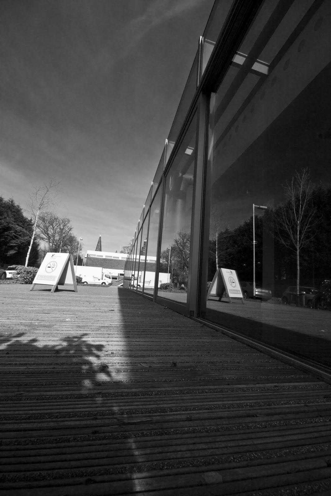
    I missed the morning session of the class due to personal reasons so wasn't sure exactly what I was required to do.  However, after speaking to colleagues, I was told we were given the task to photograph something using the wide angle lens from a high or low perspective.  I still wasn't too clear about it but went on to seek inspiration around the college.
    Using the college wide angle lens (Sigma 10mm-20mm) I took quite a few photographs from a low perspective.  The resulting images had, what you may refer to in technical term, as perspective distortion.  In lay mans term, perspective distortion is when an object that is closer to you appears bigger than something that's farther away.  This can be used in a creative way to emphasise specific elements in an image.   
    Below are some of my efforts from the day.  I'm not very happy with what I've achieved so I'll be having another go at this. However, given my limited understanding of the task I feel the images just about demostrate the effects of wide angle perspective distortion.      


    Saturday, 3 November 2012

    Shutter Speed/Abstract - Xavier Rey

    Self taught, French Fine Art photographer Xavier Rey only came to photography as recently as 2005.  Xavier is well known for his square, sea and waterscape photographs.  Majority of them taken in black in white with a very long exposure.  He's images are very minimalistic and have clean, soft lines and dream like feel to them.  The long exposure has helped to create a fluidity in the movement of his images.  They also have a very abstract feel to them.    
    When I look at the images I feel they bring a certain sense of serenity, calmness and tranquillity.  Looking at his images it's so very easy to get lost in the moment - that moment of quite reflection.  This is one of the most wonderful ways of using long shutter speed and producing some fantastic images, of the beauty that surrounds all of us.      


    Shutter Speed/Abstract - Chris Friel


    Chris Friel is a colour blind, British painter who recently turned to photography in 2006.  Chris has been shortlisted for Sunday Times Landscape Photographer of the Year on many occasions.

    When I first came across Chris Friels's photography I was completely blown away! His images are very atmospheric and have an ethereal feel to them.  They are breathtaking and captivating - Chris has managed to master the art of innovation and creativity with his images.
    Using very long shutter speed, ND filters, Tilt Shift lenses and intentional camera movement, Chris manages to create unique masterpieces, which look absolutely stunning and very much like paintings. 

    Looking through his images has certainly inspired me to try and emulate some of his techniques to achieve results which may be of a similar nature.
    For someone who's drawn to landscape, colours, movement and shape I am completely mesmerised by his images! 

    The intensity of colours, the softness of the texture and the abstract nature of the images are pretty awe-inspiring and certainly feel very special. 


    Friday, 2 November 2012

    Depth of Field - Sally Mann

    Born in 1951 in Virginia, Sally Mann is one of America's most renowned photographers and has received critical acclaim for her Immediate Family series.  This was a series of portraits of her children, often in the nude and taken outside.  The images have a dark and moody and sometimes unsettling feel to them.  Even though portraits of children, they have a very grown up feel to them - often demonstrating the loss if innocence.  The images are quite hypnotic in a way and draws you in to look further and beyond what you're seeing.    

    Sally Mann's fascination with controversial subjects like death, decay, mortality and the human body is evident in most of her images.  Non more so than in her fifth book titled What Remains.  Her photography can appear very morbid and haunting for the viewer to digest, and provoke some strong reactions.  Her images challenges you to question your own fears of subjects like death and mortality and brings it all to the forefront - there's no hiding away from the reality of life and death. 
    The imges below focus strongly on the faces of the children - their expressions, their body posture and their little individual personalities.  I don't feel they're quite reflective of what a typical image of a child should look like or the perception we have of how childrens images should be.  Shallow depth of field allows the viewer to be transfixed on the faces of the children and concentrate less on the background.          


    This is one of my favourite images of the three children - adopting a very defiant stance - showing their strong characters 


    Saturday, 20 October 2012

    Shutter Speed

    Alongside DOF, another of the key elements of exposure control is Shutter Speed.  This is usually measured in units of Exposure Value.  The shutter speed controls how long the sensor or a film plane is exposed to light.  Shutter speed is measured in seconds and fractions of a second.  The photographer has greater flexibility to determine how long they want to expose the sensor to light, depending on the effect or result they would like to achieve - whether 1/200 of a second (very fast shutter speed) or 1/4 second (very slow shutter speed - long exposure).  Another setting for controlling shutter speed is BULB. This allows the photographer to determine how long they want to keep the shutter open.   
    Using shutter speed you can freeze movement and works well with waterfalls, sports or any fast moving subjects.  Slow shutter speed is also great for deliberate motion blur and low light photography as well as catching light trails when doing night photography.  To minimise blurring when shooting with a long shutter speed it is important to use a tripod, although Image Stabilisation also helps to keep the image in focus.  These days the semi automatic setting Shutter Priority in digital cameras allows you to set the shutter speed and the camera determines the rest. 
    I discovered the joys of playing with shutter speed when one cold November evening I decided to do some photography during bonfire night.  I wanted to initially photograph fireworks but being a complete novice I was unprepared and did not have my tripod with me.  So I thought I could try photographing the fairground rides.  At first I was pretty unimpressed with the results and they didn't blow me away.  But then I started playing around with shutter speed and started using very long shutter speed whilst adding movement when photographing the rides - I was pretty ecstatic with what I achieved! I ended up with something pretty amazing and very abstract.  I loved the way the lights came alive and took their own shape - each one beautifully unique in it's own way.
    Experimenting with shutter speed can be a great way to feed your photographic creativity and manipulate the visual effects of the final image.
    Some of the images below from the Debdale park fairground rides. I love the dramatic structures, colours and shapes of the images. To me they convey drama, speed and excitement.  
    f8, 1/8th, ISO 200, 39mm


    f8, 1/8th, ISO 200, 55mm


    f8, 1/6th, ISO 200, 55mm


                                                                                  f6.3, 1/8th, ISO 200, 21mm - Barton Square at Xmas


    Tuesday, 16 October 2012

    Depth of field - Sebastiao Salgado

    Sebastiao Salgado is one of the masters of social documentary photography.  Born in 1944 in Brazil, he initially trained as an economist.  He often travelled to Africa as part of his work and this is when he started to take an interest in photography.  In 1973 he abandoned his career as an economist and took up photography.  He travelled to Africa to document the famine travesty there.  He joined the international cooperative of photographers Magum Photos in 1979 but left in 1994 to start his own agency, with his wife, Amazonas Images.
    Salgado has won numerous photographic prizes and is most famous for his social documentary images of workers in less developed countries. 
    Most of his images are black and white and are quite are dark and moody.  Salgado's images show a moment in passing, even if the subjects appear to be still in the image.  Salgado's images go beyond the realm of photo journalism - they show real engagement with the subject and tries tell the story with greater complexity.  Salgado often documents images over several years.  His images are technically brilliant and each image gives a small glimpse of the real story that lies behind each photograph.  Although a champion of documentary photography, Salgado's images are very aesthetically pleasing and sometimes considered too beautiful.     
              
    This is a really good example of shallow depth of field - the person in front is clearly in focus and the two people behind are slightly out of focus


    This is one of my favourite images - beautiful silhouetted people against the mist and the haze.  The texture and contrast, dark and shade makes you linger on this image - makes you think about their journey and what lies beyond