I had a few different ideas for my Brief 1 - Exterior Location, but for some reason I think the forces of nature were working against me!!! All my attempts to try and work on a particular idea was fraught with disappointment to say the least!
One of my initial ideas was to photograph shadows and reflections - this is something I'm very familiar with and have photographed many images in the past that fits in with this theme. It soon became apparent that it is a very popular theme and I wasn't alone in wanting to do this! So I decided maybe I needed to do something a little bit different - as well as being a perfectionist, I hate doing the same thing as everyone else! and I also thought maybe it would be good for me to get out of my comfort zone.
Just a few of my shadows and reflections images -


I also toyed with the idea of photographing people at the local market - which in theory seems ok but the more I thought about it, the less appealing it became. For someone who loves landscape, seascape, abstract etc photographing people is quite a scary prospect, and not always very appealing. I know I wanted to be out of my comfort zone but I also wanted to have some good photographs and for that to happen, the subject matter would have to interest me. And how appealing would this subject be to the viewers if I couldn't get myself motivated for it! It was also quite similar to a theme a colleague/friend was doing for his brief - and you know me - gotta stand out from the crowd! So I knocked this idea on the head!
One idea that I was very keen on, was photographing a Diwali event - for those of you who are unsure of what I'm talking about - Diwali is a festival of light, celebrated by those who follow the Hindu faith. I was quite excited about this as I love anything to do with colour, light and movement. A wonderful opportunity I thought to get something unique with a mixed array of colours, people and different types of activities. The date was set for 28th Oct at Platt Fields Park. I was pretty excited and was looking forward to getting some great images. The day of the event came and the heavens decided to open up!! wet and miserable all day!! just my luck! I missed my only opportunity to get something unusual! By this stage I was running out of ideas!!
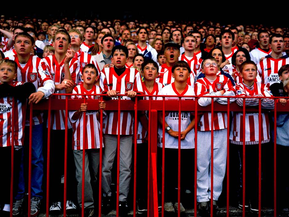
However, I did have one other idea up my sleeve I could pursue! As part of my trip out to Manchester we went to see an exhibition called Homes of Football by Stuart Roy Clarke at the Urbis. Inspired by the diversity of images produced by Clarke I decided to contact the Communications Director at Sheffield Wednesday football club. As I have watched many matches at Hillsborough, it was a ground I was pretty familiar with. I wanted to capture the atmosphere and the spirit of the people at the match, rather than photographing the footballers. To my utter disappointment I received a response saying I should start with the academy team first - meaning the under 18's team, before I "faced the cut and thrust of a team match"! Feeling a little bit patronised I sent off a response to argue my case but to my surprise I received no further response. So that was the end of that!!
Luckily for me I had one more idea I was keen to explore . . . . watch this space!!!

Just a few of my shadows and reflections images -
 |
| I really love this beautiful majestic building - I think the person in the image adds a bit of human interest to the image - Old Royal Naval College, Greenwich, London |

I spotted this shot as soon as I got off the train at Euston - luckily my camera was handy - you know what they say never go anywhere without your camera! There's some great lines of reflection coming through the windows, from the lights and the train and they mirror each other in such a beautiful way too.

This was from a trip out to Salford Quays - simple, elegant and beautiful

A visit to Chatsworth House enabled me to take this picture. I love the warmth of the lampshade reflected on the mirror, lighting some of the bed - could almost be someone's bedroom


The two images above was taken at Media City, Salford. It's a great place for reflections because of the glass buildings - makes for great photography especially on a sunny day
One idea that I was very keen on, was photographing a Diwali event - for those of you who are unsure of what I'm talking about - Diwali is a festival of light, celebrated by those who follow the Hindu faith. I was quite excited about this as I love anything to do with colour, light and movement. A wonderful opportunity I thought to get something unique with a mixed array of colours, people and different types of activities. The date was set for 28th Oct at Platt Fields Park. I was pretty excited and was looking forward to getting some great images. The day of the event came and the heavens decided to open up!! wet and miserable all day!! just my luck! I missed my only opportunity to get something unusual! By this stage I was running out of ideas!!
However, I did have one other idea up my sleeve I could pursue! As part of my trip out to Manchester we went to see an exhibition called Homes of Football by Stuart Roy Clarke at the Urbis. Inspired by the diversity of images produced by Clarke I decided to contact the Communications Director at Sheffield Wednesday football club. As I have watched many matches at Hillsborough, it was a ground I was pretty familiar with. I wanted to capture the atmosphere and the spirit of the people at the match, rather than photographing the footballers. To my utter disappointment I received a response saying I should start with the academy team first - meaning the under 18's team, before I "faced the cut and thrust of a team match"! Feeling a little bit patronised I sent off a response to argue my case but to my surprise I received no further response. So that was the end of that!!
Luckily for me I had one more idea I was keen to explore . . . . watch this space!!!
Some of the images by Clarke from his latest exhibition at the Urbis - very vibrant, full of life and colour. Capturing the tense, emotional roller coaster ride of a football match